Restora🌴
A redesigned hotel booking experience smarter search, cleaner decisions, transparent pricing
00

problem
Existing hotel booking websites overwhelm users with cluttered promotions, hide fees until checkout, and don't support the full range of reasons people book from immediate last-minute stays to carefully planned group holidays. Users waste time comparing across multiple tabs and struggle to trust what they see.
solution
Restro is a hotel booking web platform designed as the final project of a UX/UI design course. The goal: apply the complete UX process from competitive benchmarking through annotated hi-fi prototype to a real, well-understood problem space.
Restro : Redesigning How People Book Hotels
Every hotel booking platform promises simplicity. Few deliver it.
For my UXDI diploma project, I was tasked with redesigning the hotel booking experience a space crowded with cluttered interfaces, overwhelming filter options, and checkout flows that lose users right when they're ready to commit. My subject was Restro, a hotel booking redesign targeting travellers who wanted clarity, not chaos.
I started where every good UX project should: with the user. Through surveys with 13 participants, I mapped how real people search for and book stays what frustrated them, where they dropped off, and what they actually needed before hitting "Reserve." The data pointed to three consistent pain points: confusing search flows, pricing that felt hidden until the last step, and a filtering system that created more noise than direction.
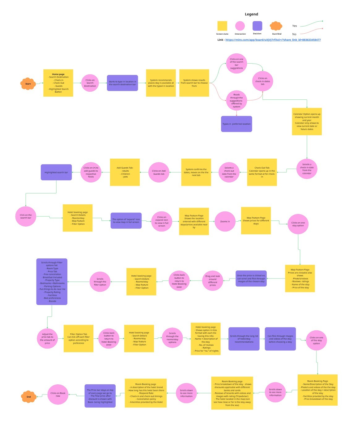
From there, I moved into structured ideation. I built a detailed flow diagram mapping every decision point a user encounters — from entering a destination, selecting dates and guests, applying filters, exploring the map view, comparing prices, all the way through to the room booking page. Every branch was a deliberate design decision.
I translated those flows into hand-drawn wireframes, sketching out the property listing page with a sticky pricing sidebar, coupon drawer, refundable vs. non-refundable rate options, and a clear "Reserve Now" CTA. The house rules page and cancellation policy layout were designed to surface trust signals early — because anxious travellers make booking decisions based on confidence, not just price.
The result was a cleaner, more considered booking experience — one that respects the user's time, makes pricing transparent from the start, and removes friction at every critical decision point.
Restro taught me that good UX isn't about adding features. It's about removing the ones that get in the way.
🔗 Full case study: https://separated-eustoma-e91.notion.site/2b103dd3de7e81f7bf6bcad82e0bc757?v=2b103dd3de7e81aabc4e000c70f318b8&pvs=143
year
2025
timeframe
3 months
tools
Figma, Adobe CS
category
UI/UX
01

02